
Branding / Branding | Social Media | Website Design
Quara Finance Brand Lift

01 / The thinking
THE IDEABEHIND IT.
Quara Finance is a Saudi company liscenced by the Saudi Central Bank that delivers Shariah-compliant products and financing solutions instantly to customers through one simple app.
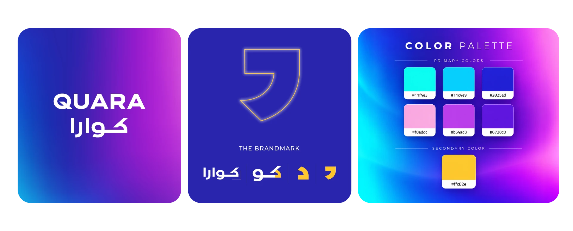
The new logo is a bold logotype with a strong feel to create an impact. It’s distinctive for its sharp letters, especially the “Q” in English and the “kaf” in Arabic. The color palette is consistent of a main gradient along with its deconstructed colors as primary colors and 1 other secondary color. In order to make the brand more distinctive, we created a brandmark that will be used on visuals. This brandmark is derived from the logo and offers the brand a unique element.
02 / THE APPLICATION
Visual Identity& Applications.
Brand Visuals
The brand’s visual identity is dynamic, vibrant, and colorful, designed to connect with a younger audience through a fresh, energetic, and contemporary look.
Social Media
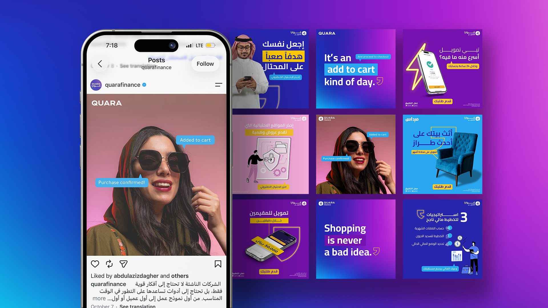
The social media content follows a playful and colorful visual direction, combining awareness, campaign-driven, and interactive posts. The grid is strategically structured, with the middle column featuring fun, English-led content on vibrant gradient backgrounds, while the side columns focus on informative, campaign, and awareness content using solid brand colors. This creates a balanced yet engaging visual rhythm across the feed.

Next project / Keep exploring