Campaigns / Advertising Campaigns | Social Media Design
Irthi
01 / The thinking
THE IDEABEHIND IT.
Irthi is an organization that works with partner organizations and championing artisans and designers while aiming at empowering women professionally and socially through traditional and modern arts.
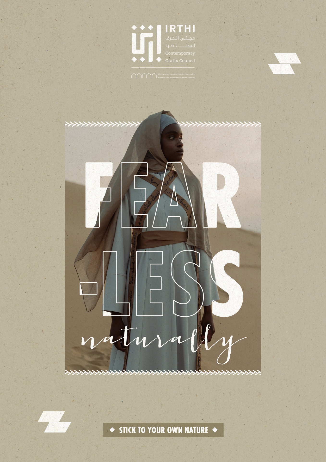
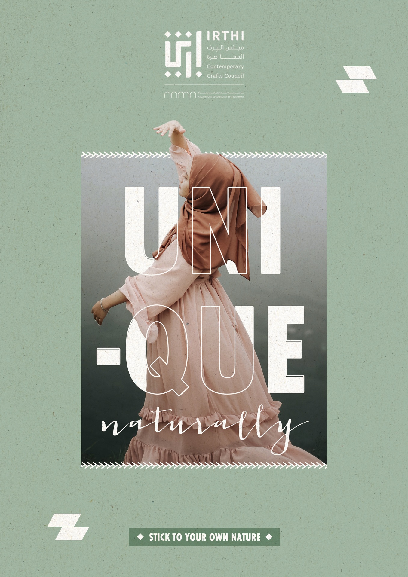
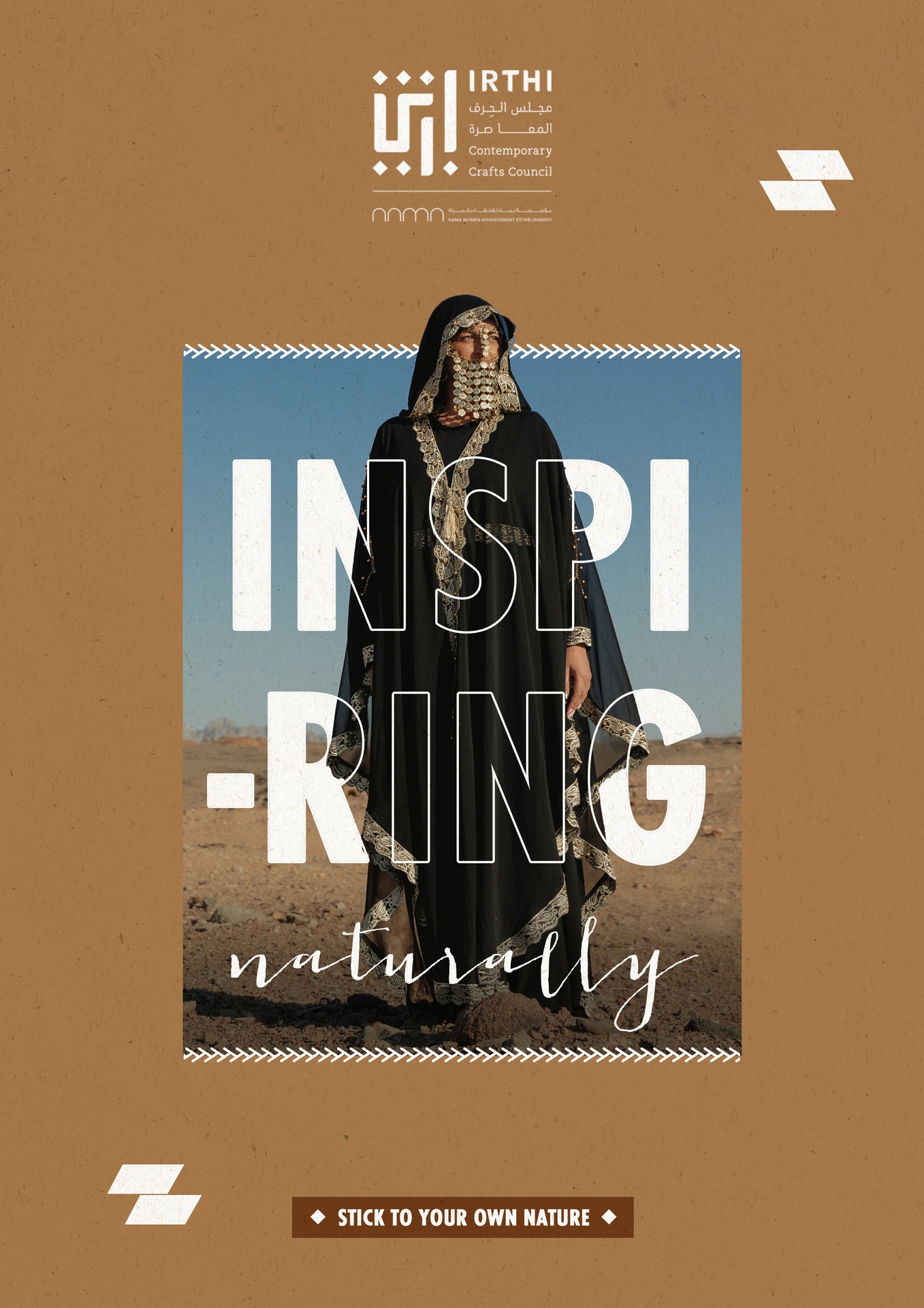
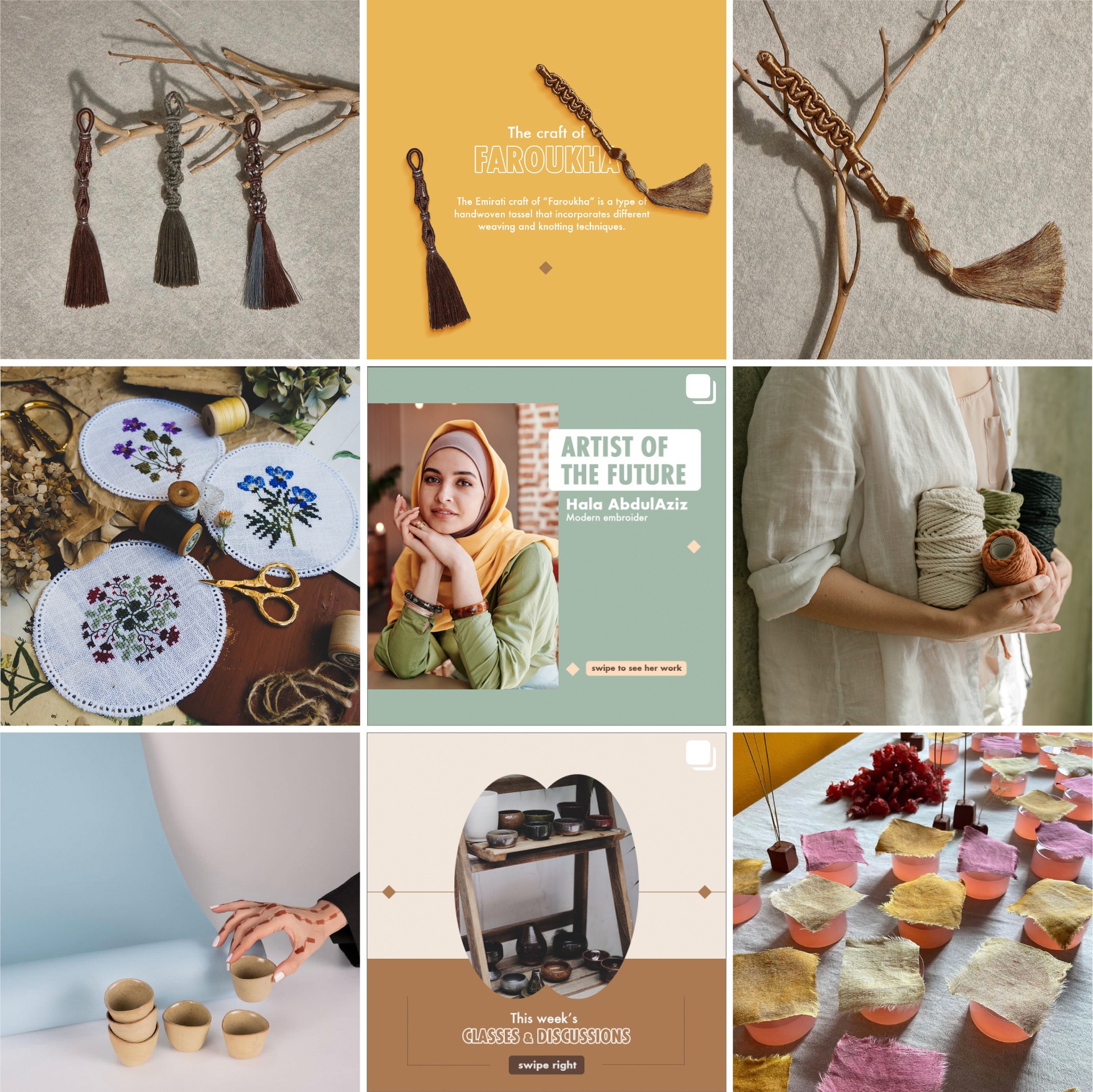
In this tactical campaign we got inspired by the term and idea of “Mother Nature” which also refers to a woman being a personification of nature that focuses on the life-giving and nurturing. The expression has always been known to represent women rather than men, and through its meaning it empowers women. This has been translated in the campaign through adjectives that represent women accompanied by the word “naturally” to show that these adjectives, needless to say, describe women. The art direction is simple and neat, it focuses on integrating the typography within the image. The photography style has a nomadic feel, showcasing the Arabic woman in an open space.
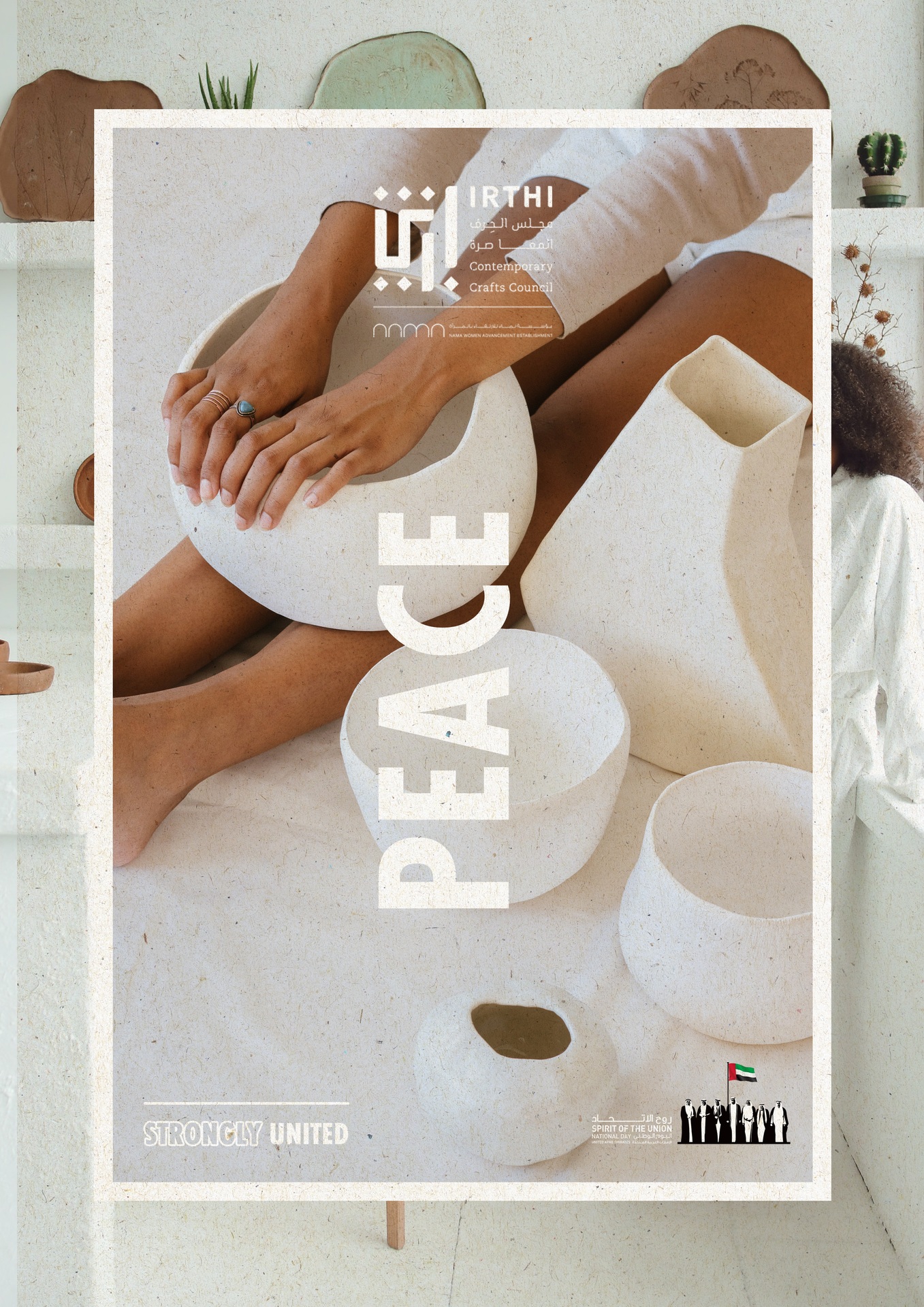
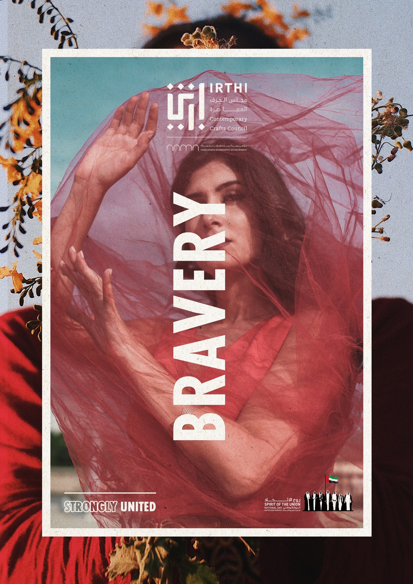
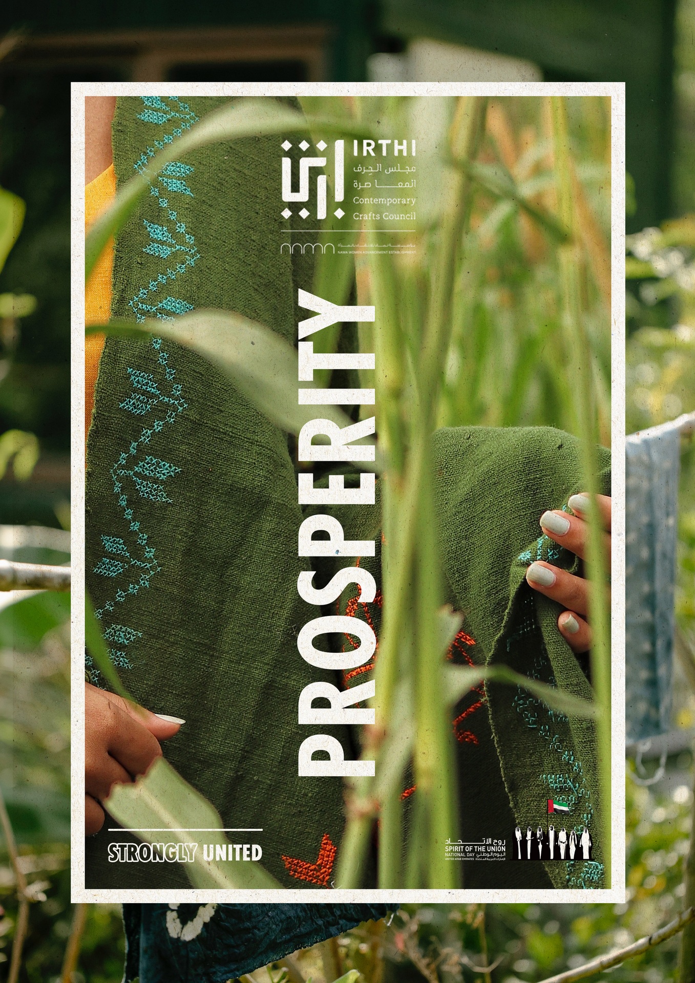
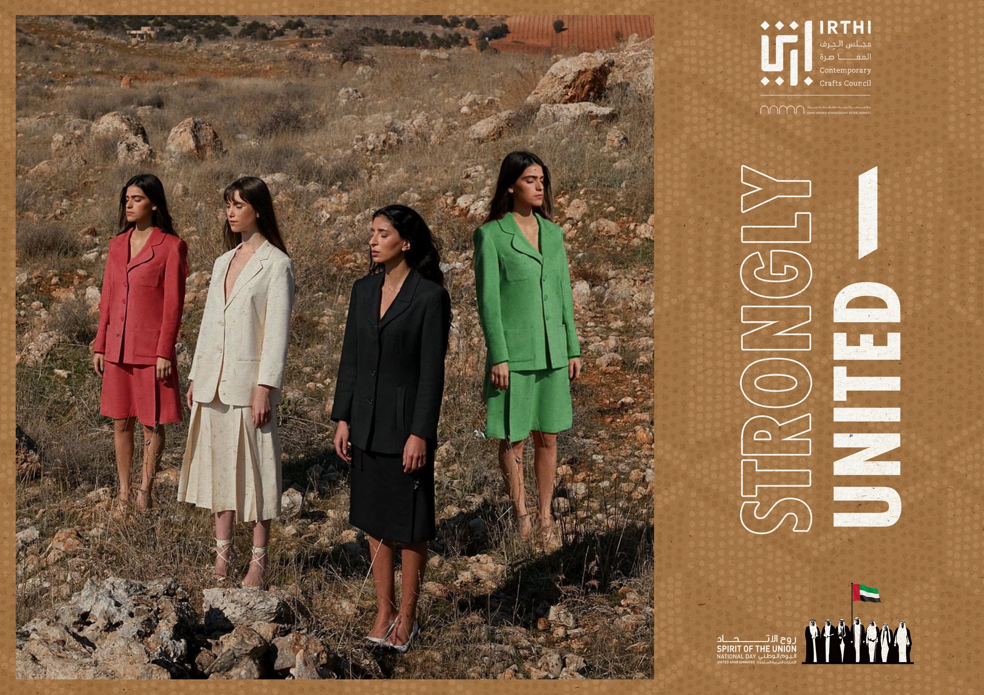
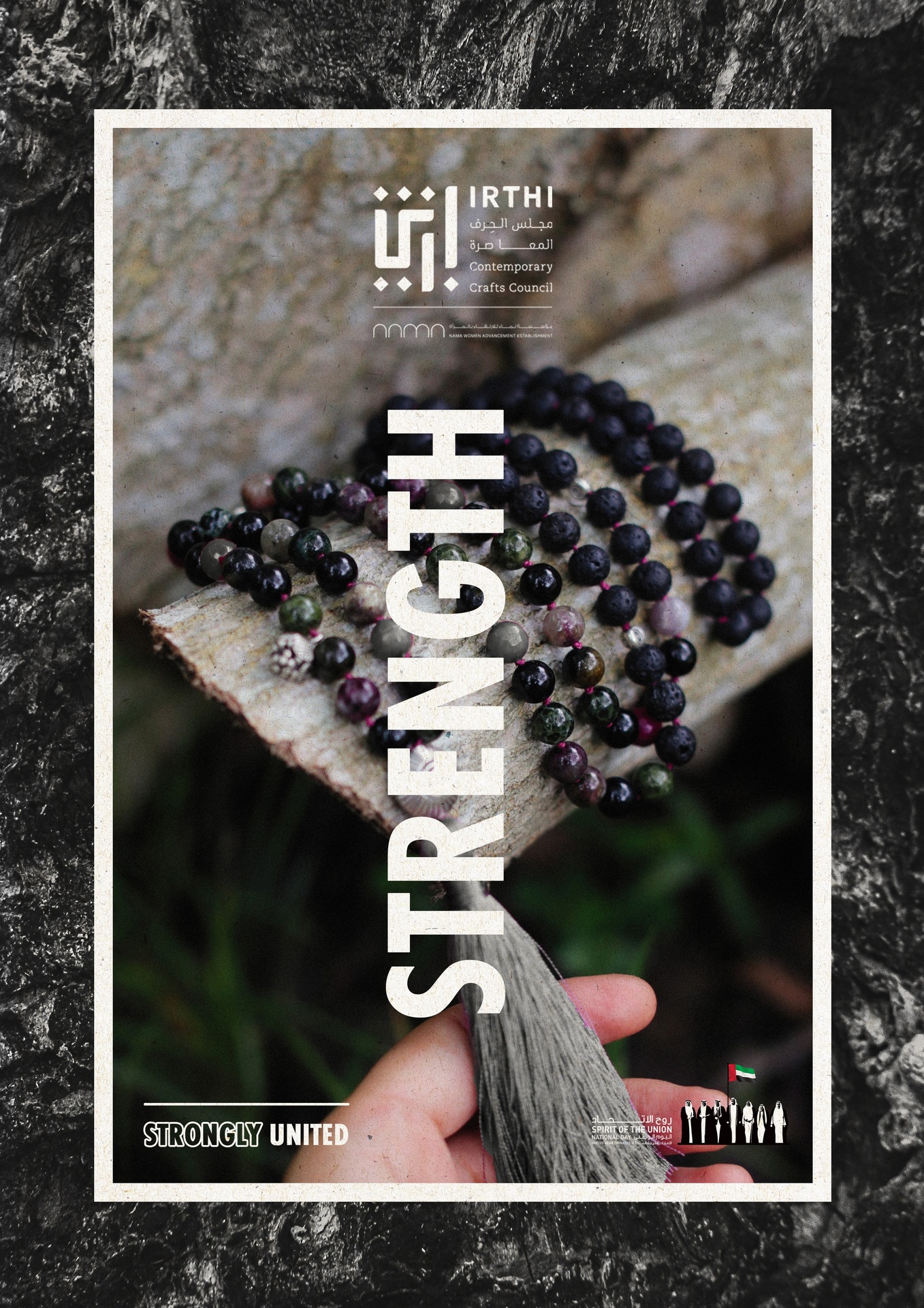
In this occasional campaign, we focused on combining the importance of women supporting each other with the fact that the UAE unites cultures. The idea is to launch a special edition collection inspired by the colors of the UAE flag, red, green, white and black. The campaign is followed by visuals that translate the strong meaning of each color that also represents women. The art direction focuses on photography with a bold type. The photography style is set in nature and is inspired by style of the brand.
The Key Visuals
Next project / Keep exploring